Introducing the New Persimmony Brand
Why now
Our commitment to our mission remains the same as ever, but a lot has changed since we first launched in 2002. Our task is not a simple one: to make paperwork both easier to complete and at the same time more comprehensive; to reduce double-entry while also increasing the quality of the data.
This is another in a series of changes we have rolled out over the past twelve months to achieve this goal. First we brought all our products together into one interface, Persimmony Suite. Then we phased out legacy back-end technology and upgraded to a new platform with increased speed and reliability. Meanwhile, we have been standardizing features and the user experience across the product in hundreds of small changes that may not be immediately noticeable, but which make our products more consistent and intuitive. These include minor improvements like standardizing all “exit” buttons and the layout of pop-ups so you can easily engage with them, without added thought.
Now, with this redesign, our software is not just faster and easier to use, but clearer and easier to navigate.
What is changing
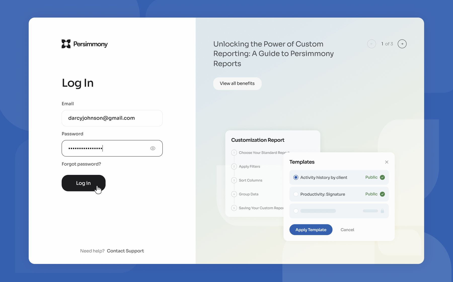
New font, new logo and new color scheme. This has been applied to our website, login, product, emails, social channels ... anywhere you see Persimmony.
Coming soon, we will also improve the way you log in to use our software, with an upgrade in our authentication and security.
What isn’t changing
The redesign is, as the saying goes, only skin deep. This update has not changed the product other than updating design elements such as fonts and icons (more on this below.)
Introducing our new identity
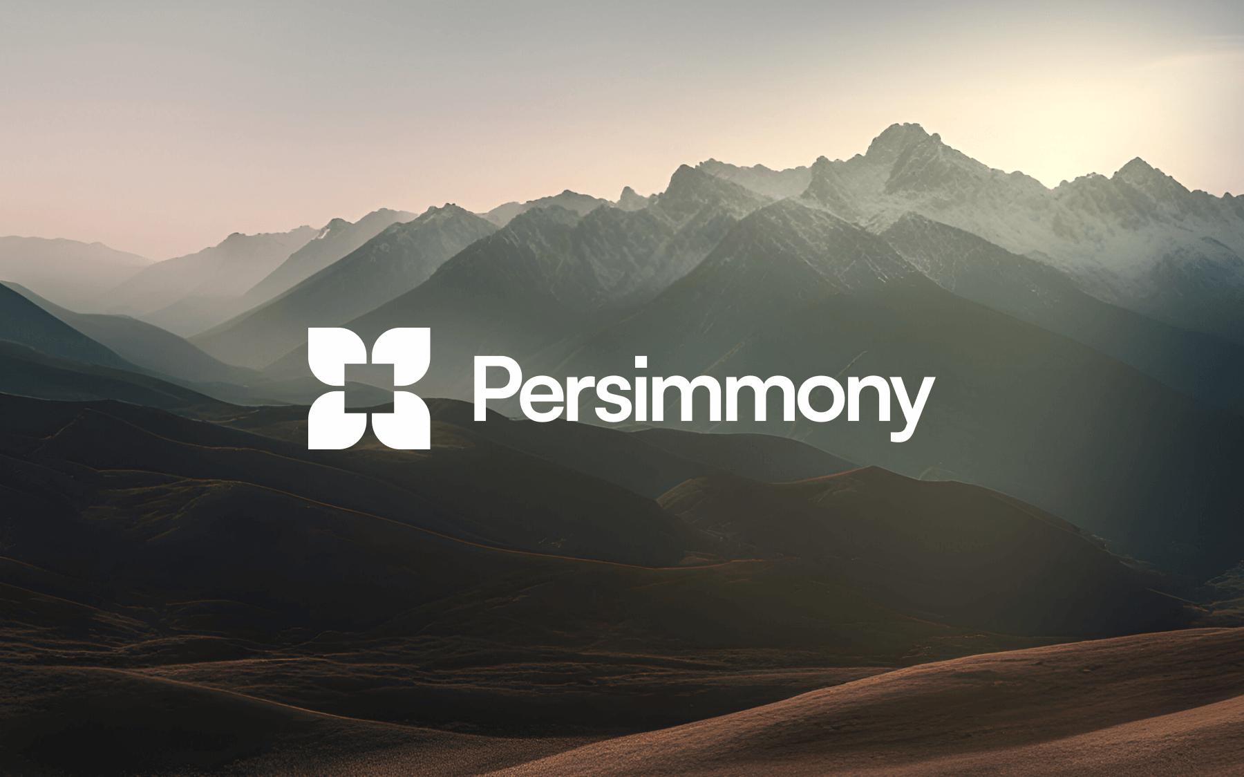
The Logo
We needed a logo that represents what we do. The petals of the flower are based on the delicate blossoms of the Persimmon tree, our namesake. The square represents a vault, something reliable and solid. Together, this new logo is cleaner and clearer, and talks to both our care and commitment and our dedication to security and reliability
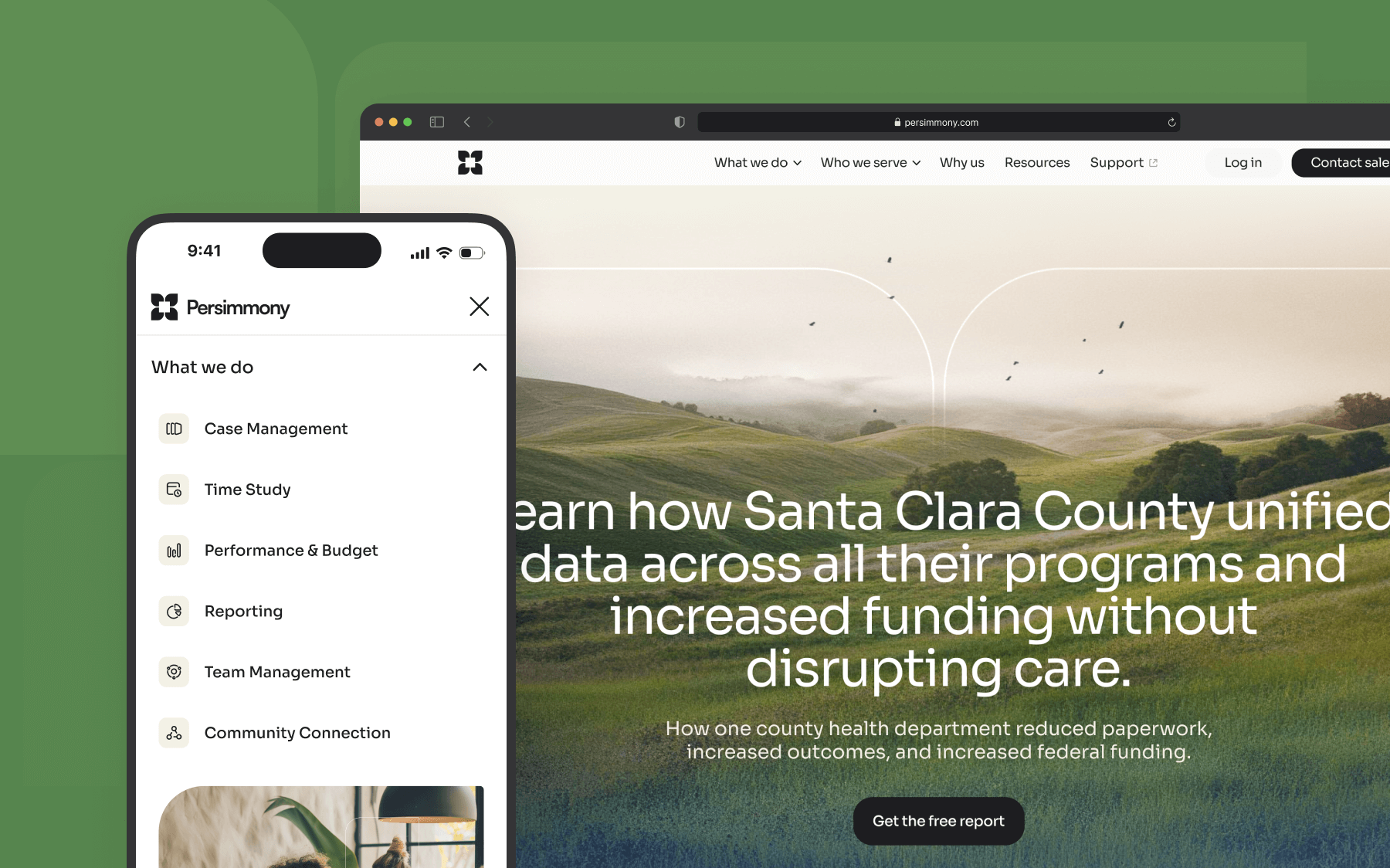
The Website
We've completely reimagined our digital presence to better serve you. The new website features:
- Intuitive navigation
- Better messaging and clearer visuals
- More case studies and blog articles
- Clearer links to login, support and other important online features
- A new login experience (coming soon)
New Login Experience (coming soon)
We've enhanced our login process to better communicate with our users.
- More secure access protocols = more secure than ever
- Streamlined single sign-on options
- Two factor authentication as default, with more choices
- Self-service and more intuitive password recovery
- Better login messaging to keep you in the loop
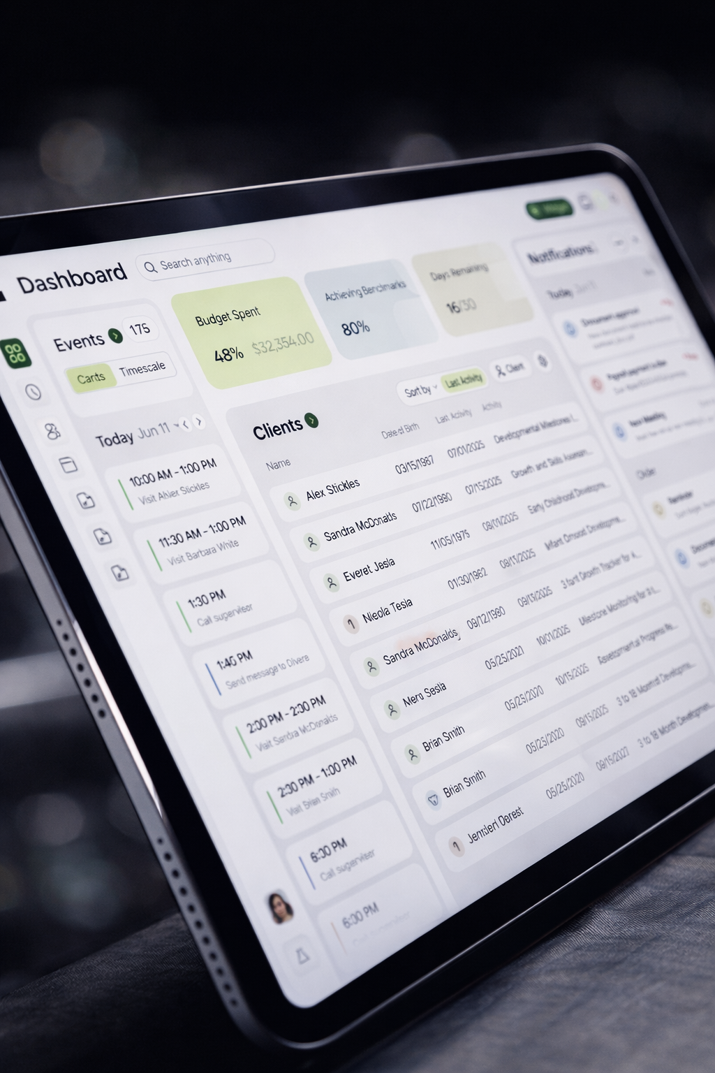
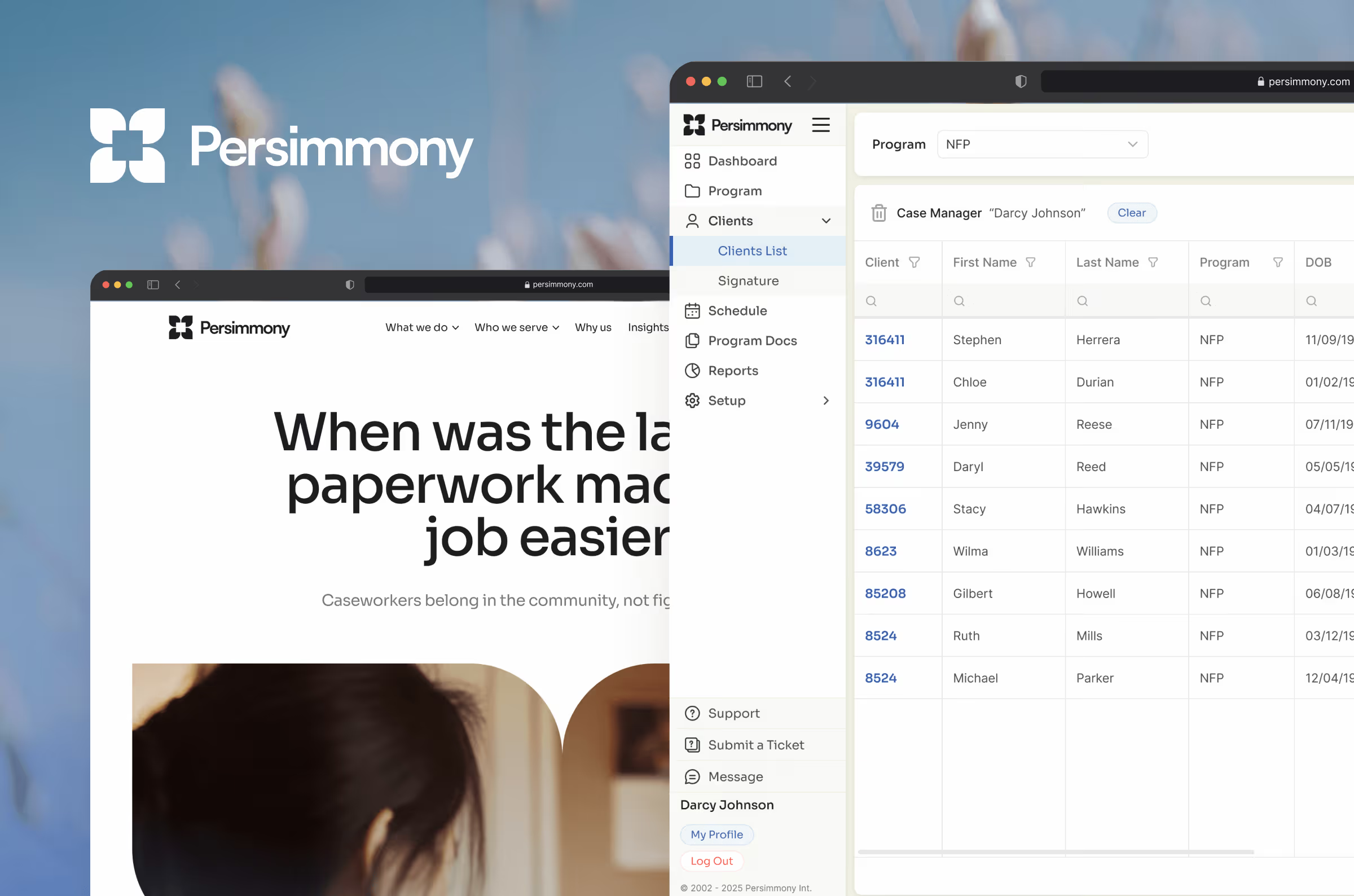
Persimmony Suite
Last, but by no means least, we've incorporated the new branding into the product itself to make it more intuitive, cleaner, and easier to use. All the same functionality, better looking.
- New fonts to make the product more readable
- Better sizing to ensure the most important elements are most visible
- Updated colors, button style, and line strokes to make it clearer than ever to read tables and see what's important
- New and improved icons that are more descriptive and more consistent

Looking forward
This rebrand represents more than just a visual update — it's a reflection of our evolution and our commitment to ongoing excellence. As we continue to grow and innovate, our new identity will help us
- Better communicate our comprehensive suite of solutions
- Connect more effectively with the communities we serve
- Enable more self-service and exploration within our products
We want to hear from you
Your experience and feedback have been instrumental in shaping not just our products, but our entire approach to service. As we roll out these changes, we invite you to:
- Explore our redesigned website, social channels, and product
- Share your feedback on the new experience
A note of thanks
This refresh wouldn't be possible without the trust and partnership of our customers. Your feedback, collaboration, and dedication to public service continue to inspire us every day. Thank you for being part of our journey.